
The Importance Of User Experience In Web Design
11 Apr 2024
Read Now ›
While using a website, how many clicks should it take a customer to find the information or product they’re looking for? Is there an ideal number? Is five clicks too many?
It’s a simple question that seems to deserve a simple answer. People generally don’t want to jump through unnecessary hoops to get what they want, so it stands to reason that the fewer the number of required clicks, the better the user experience. However, in responding to this problem it’s important that designers and their clients keep in mind the underlying principle behind why this is – or, why more clicks lead to a bad user experience in the first place.
Friction is not a specific or divisive concept in UX (user experience) design, on the contrary, it’s a basic and simple idea that is fundamental to design in general. If a user is trying to purchase a product on a website, friction is anything that reduces their momentum and makes that journey more difficult. Similar to how driving a car from point A to point B is hindered by pot-holes, confusing signs and traffic, a digital experience involves overcoming a variety of different obstacles from confusing content, ambiguous navigation links, long page load times and more.
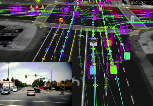
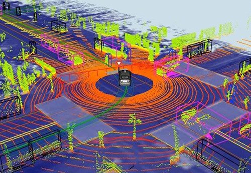
What a self-driving car’s radar sees when navigating a city street.
Hypothetically, If we could have any question answered just by thinking it, that would be a frictionless experience. Life would be easier, conducting research would be a trivial activity and the complete nature of questions would change completely. Such is the impact of friction.
Today, however, like primitive savages we derive most of our answers by tapping and swiping on glass screens. The interactions that impede this experience, (no matter how small) are the factors that create friction – from text that’s too small read to the drop of juice that landed on the screen creating literal friction when you try to swipe.
We spend large amounts of time trying to figure out how the pages of a websites are organised, where to find the answers we want, trying to tap on countless buttons and links, opening tabs, waiting patiently for things to load, scanning thousands of words, and trying to work out a correct syntax of words to get Siri or Google Assistant to work. All these little experiences add up and become the background noise of our interaction with a digital product.
Friction isn’t just an isolated aspect of a user experience, it’s a fundamental driving principle. A good user experience demands a user flow that requires the least amount of effort to accomplish – one with the least amount of friction. So naturally, we would want to reduce it as much as possible, wherever we can.
Our capacity to think and process information has been stretched thinner than ever in the information age. As a result, both a product’s simplicity and ease of use have a much greater impact on how we value it in within the context of our lives. When interacting with a digital experience, a user at a mental crossroads should know which direction to go with as little thought as possible. Any moment of active thinking will drastically add to the cumulative mental load on the user, ultimately making the experience that much more cumbersome.
While the methods used to reduce mental load depends on a large number of factors such as the target audience, brand awareness, the landscape of the industry in question etc. They are all rooted to the same end goal: reduce friction on the user.
Looking at the bigger picture, it’s also important to understand how technology and data-driven systems can drive more intelligent and accommodating user experiences. It’s no coincidence that today’s most emergent technologies have far-reaching applications in making machines do the thinking for us. Machine learning and AI can provide suggestions, tailor solutions and give us shortcuts to the information we need. In practice, these technologies are fueling entire industries, but are also available in micro-design applications, such as dynamically generated page layouts and predictive searches.
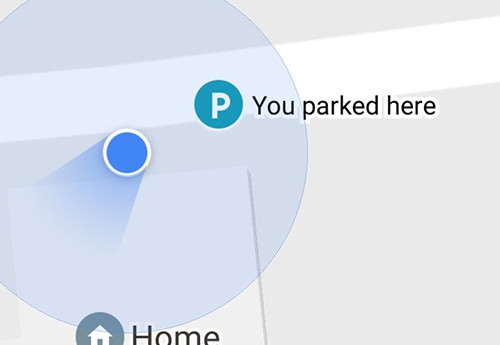
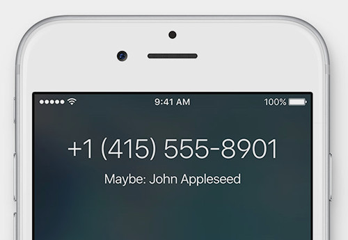
Our digital services automatically tell us where we parked our cars or who a caller might be, simply by parsing the data that surrounds us.
While this space will advance rapidly over the coming decade, the principle behind them will remain the same and be the driving force behind whether an application is appropriate to that context or product. Should you use AR for your app? Should you allow a user to customise their notification settings? Should the navigation menu have 2 levels or 1? The answer lies in whether it helps alleviate or add friction to the user experience.
When a task takes up more time than it should, it begins to seriously impact the perceived value of the intended goal. If it takes a whole day to do something you truly want, you may start to question whether you wanted to do it in the first place.
Friction arises from both the forced actions that take up our time, as well as the waiting time between actions. These include everything from page load times, time spent filling out long forms, time spent waiting for a call back, down to the milliseconds spent waiting for an animation to finish.
Generally, time is the constant background factor that slowly adds drag to the user’s flow. It is the aspect that slowly drains the user’s patience and goodwill toward a digital experience and the methods of alleviating it can come from either reducing or masking the user’s perception of it.
Reducing
The direct way to lower the friction caused by time is to reduce the time itself. Shorter page loads, a fewer number of required inputs, quicker responses to user queries, and less time required to consume content. Communicating to the user through content is important and while it’s often a difficult decision to remove or marginalise certain parts of the content, always keep in mind that content is only useful if the user is engaged and wanting to consume it. If the book’s too thick, it doesn’t matter how interesting it is, some people won’t even pull it off the shelf.
Masking
The loading animation is one of the simplest and most elegant design solutions to the persistent problem of waiting for things to download. Early web designers discovered that by merely hinting that progress was being made on a lengthy task, users become much less bothered by being forced to wait. Essentially this method reduces the tedious feeling brought on by nothing happening, a feeling that drastically heightens our awareness and perception of time. Even a humble spinning icon is enough to soothe a user into sitting idle for a few seconds longer, giving a sense that the invisible machine is literally turning its gears for the user.

Feel free to keep reading while this image loads.
Where possible, sacrificed time should be masked so that the user’s attention is deflected onto something else, or the wait is justified by additional value (such as explaining why things are taking so long, or providing tips or additional value-adding reading while they wait). This isn’t simply limited to adding loading animations to submit buttons but applies to all areas where the user may be forced to wait or experience lag in-between actions. Separate long forms and tasks into smaller, more manageable steps and pages, have viewable content accessible to the user in areas where they are forced to wait or remind the user of the benefits of what they are doing and how far they’ve come in a multi-stage process.
When in doubt, simply draw the concept of friction into the question. Rather than ask:
‘How many clicks should it take the customer to find the information or product that they’re looking for?’
Think on:
‘how can the navigation scheme of a website be as frictionless as possible?’
Doing so will ensure that in reducing the number of clicks, you’re not making your navigation scheme over-simplified to the point where users have a hard time finding what they want. Fewer clicks are the result of the objective, not the objective itself, and sometimes an extra click in certain situations will serve the customer better.
While it’s easy to get lost in the process of creating or contributing to the design of a positive user experience, keeping the principle of friction top-of-mind will ensure that the solution is grounded to the overarching goal and that it’s ultimately answering the right question.

Most people would find carrying such immense artistic flair exhausting, but Jerry takes it in stride. Putting his calm and collected demeanour to good use, Jerry absorbs the world around him and is a walking library of unrelated facts and trivia.
11 Apr 2024
11 Apr 2024
11 Apr 2024
11 Apr 2024
11 Apr 2024
11 Apr 2024
03 Apr 2024
03 Apr 2024