
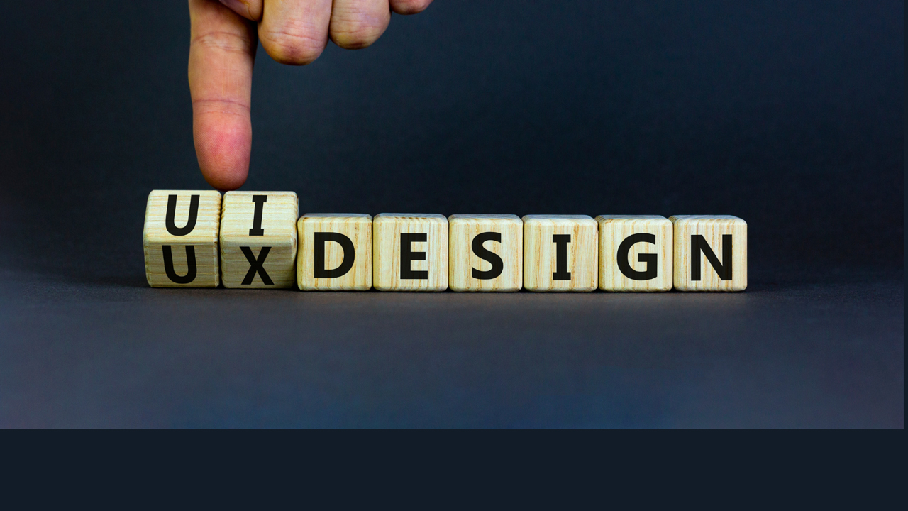
The Importance Of User Experience In Web Design
11 Apr 2024
Read Now ›
Imagine entering a library (the original search engine, if you will), only to find all the books scattered on the floor. You’d likely leave frustrated without finding what you’re looking for. The same principle applies to web pages and applications. Without a clear presentation of useful elements, users can feel overwhelmed and lost. That’s where the hierarchy in UX design asserts its importance.
When it comes to UX, visual hierarchy isn’t just about making things look good — it’s about creating a navigational roadmap for your users. In this post, we’ll explore the elements and principles of visual hierarchy in UX design and offer actionable tips to help you implement it effectively.
Hierarchy is the backbone of UX design, serving as the visual guide that leads users through an interface in a meaningful way. When done right, it simplifies complex information to make it digestible and accessible.
In terms of user navigation, a well-implemented hierarchy can mean the difference between a user completing a task or abandoning it in frustration. It helps them quickly find what they’re looking for — whether a product, service or piece of information.
By emphasising critical elements like call-to-action buttons or important headlines, a well-executed hierarchy guides users toward making informed decisions. It eliminates the clutter and highlights what’s important.
When users can navigate a site or app with ease, they’re more likely to return and even recommend it to others. A thoughtful hierarchy creates a positive, engaging experience that encourages user loyalty and contributes to long-term success of the app or web page.
Understanding the details that contribute to visual hierarchy is essential for any UX designer. Here are some of the most crucial ones:
Text is often the first thing users notice. The typography, size and placement of text can significantly impact how information is consumed. For example, websites like Medium use larger, bold fonts for headings to capture attention while employing a smaller, easier-to-read font for the body text. This guides the reader’s eye and makes skimming easier. Larger fonts naturally draw more attention and are often used for headings, while smaller fonts are suitable for body text.
Colour isn’t just for decoration — it plays a psychological role in guiding user attention and emotion. For example, red often signifies importance or urgency, which is why it’s commonly used for error messages or call-to-action buttons. On the other hand, blue evokes a sense of trust and calm, making it a popular choice for financial or healthcare websites. Social media platforms like Facebook also leverage the psychology of blue to create a sense of community and reliability. A study by the Seoul International Color Expo documents that more than 92% of people say that visual factors are the most influential when purchasing a product.
Images and icons can quickly convey information that might take paragraphs to explain. For instance, consider the universally recognised “hamburger” menu icon often found in mobile apps. Without reading any text, users instantly understand that tapping this icon will reveal a navigation menu.
For websites, a well-chosen hero image can immediately set the tone and context. An e-commerce page selling outdoor gear might feature a high-quality image of a mountain landscape, instantly signalling the adventurous spirit of the brand.
White space, often referred to as negative space, is a vital yet frequently overlooked element in UX design. It creates a balanced layout, separating segments to aid readability and navigation.
For example, Google’s search page is a masterclass in effectively using white space. The uncluttered layout focuses user attention squarely on the search bar. Similarly, Apple’s website uses generous white space to highlight product features, making it easier for users to absorb information.
Principles of UX hierarchy — the foundations of effective design
Understanding the principles of hierarchy in UX is not just a theoretical exercise, but a practical necessity for making user experiences intuitive and engaging. By applying these foundational concepts, designers can guide users effortlessly through a digital landscape. While there are countless principles worth noting, here are a few of the fundamental ones:
Fitts’ Law suggests that the easier an object is to interact with, the more likely it is to be used. In the context of UX design hierarchy, this principle can be seen in the strategic placement of clickable buttons or links. For example, e-commerce websites often place the “Add to Cart” button prominently near the product image, making it easy for users to make a purchase. Similarly, mobile apps place essential navigation buttons within the thumb’s reach to facilitate easy interaction.
The Golden Ratio, often denoted by the Greek letter φ (phi), is a mathematical ratio used for centuries in various fields such as art and architecture. When it comes to visual hierarchy in UX, the Golden Ratio can be applied to create appealing layouts. For instance, many websites use it to divide content and sidebar spaces, creating balanced and harmonious interfaces.
When users scan a webpage, they typically follow certain patterns, the most common being the Z-Pattern and the F-Pattern. The Z-Pattern is often seen on landing pages where the eye moves from the top-left to the top-right, then diagonally to the bottom-left and finally to the bottom-right. This is why you’ll often find essential information or calls to action along this Z-shaped path.
On the other hand, the F-Pattern is prevalent in text-heavy pages like articles or search results. Users read from left to right and top to bottom, forming an “F” shape. The BBC News website, for one, employs the F-Pattern by placing the most important headlines and images along the F-shaped path.
As we conclude this guide on the principles of UX design hierarchy, remember that it’s an evolving art form — one that requires constantly adapting to new trends and user needs. And while this post could provide tremendous value to anyone trying to learn UX design, there’s still plenty to unearth in the field.
At Rysen, we offer a holistic suite of services, from strategic planning and development to digital marketing. Our forte lies in UX design, where we meticulously apply UX hierarchy principles to create visually engaging interfaces. Feel free to explore our portfolio to witness these principles in action.
If you’re keen to transform your digital interactions and create user experiences that truly resonate with your audience, contact us today.
11 Apr 2024

11 Apr 2024

11 Apr 2024
11 Apr 2024

11 Apr 2024
03 Apr 2024
03 Apr 2024
14 Nov 2023