
The Importance Of User Experience In Web Design
11 Apr 2024
Read Now ›
It takes only 50 milliseconds to form an opinion about a website according to Google. Some opinions develop within just 17 milliseconds. The bottom line is, first impressions count. And what’s the first thing a visitor sees when they land on your website?
The website header.
Your website header should be enticing and clear in what it is communicating. Your header might include an image, some copy describing your content, video, a call to action – your header is unique to your website!
There are some best practices and rules for designing a website header that grabs the user’s attention and makes them want to see more.. In this article, we’ll explore the essential elements of a website header design and best practice design tips.
In website design, the header is the top part of the webpage. It is the first thing people see before scrolling the page or clicking onto a menu item. A few years ago, the header was simply a narrow strip at the top of the page with a logo, menu buttons and perhaps a call to action. Nowadays, the header takes up a larger area above the fold – that is, the space the user sees before they scroll down.
Because it’s the first bit people see, think of your website header as a kind of invitation. It should provide answers to basic questions: What brand is represented and what products or services are offered, as well as clear navigation to the deeper pages of the site, so users can understand what you do within mere seconds.
You can have separate headers for each different web page. For example, your homepage typically has a large header, but it might be smaller on other web pages. Regardless, your header should be consistent in style.
The single most important reason a header is important is because it gives the first impression of your site. It sets the tone for every other element of your website and establishes your brand from the outset.
You often experience headers without even thinking about it. For example:
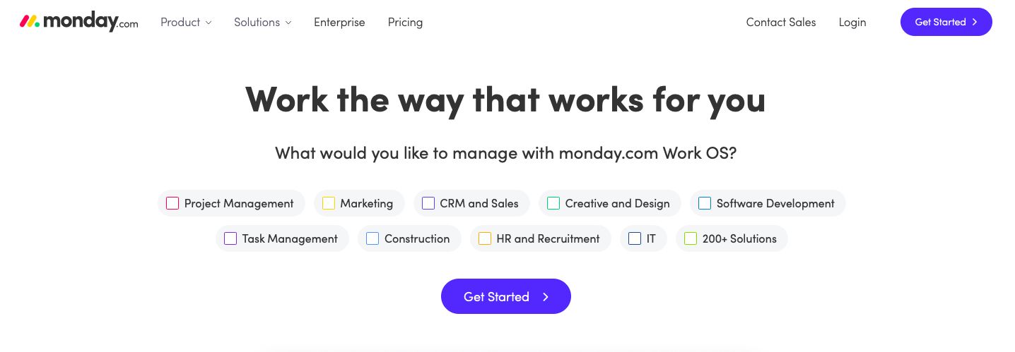
You can instantly tick the box that works for you and get started – all in the header.
That’s why web designers work hard at designing a website header that will be functional and attractive, while communicating all the right information.
A website header is not the same as a page head. Here’s the difference:
The page head is set in the code with <head></head>tags. What you put between these tags determines how services like Google’s search engine and social media platforms see the page.
A header design can include lots of important features that set up the website experience for your visitors. The most common features of website headers are:
Depending on your brand and offering, only some of these will be used in your header design. The aim is not to clutter the header as you want the information to be clear and attractive. The more information you try to cram into your header design, the harder it will be for your users to get the message.
Now, let’s explore these in detail with examples of website header design:
This area of the header is where you communicate your brand and set the tone for the website.
A logo is the easiest element to include here as it helps a visitor to identify your website in an instant and know they’ve come to the right place. If they have lots of tabs open in their browser, this is very handy.
If you’re on the Nike website, you expect to see the company logo in the left-hand corner of the page. That’s where it always sits.
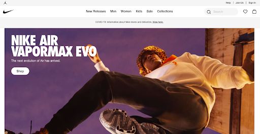
The logo usually becomes the home button too, so people can go back to the home page from another page with one click.
You can use text instead of the logo, so long as it’s obvious what the brand is.
A study conducted by the Nielsen Norman Group (NN/g) found that users are 89% more likely to remember brands whose logos are placed on the left of the header, compared to those in the centre or right. In fact, people from Western cultures (who read from left to right) spend more time looking at the left side of the page overall.
The website header is where you put your primary page links. If you have an ecommerce site, it’s where you put your main product categories.
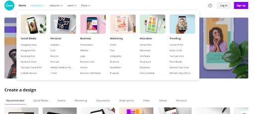
Menus can be as simple or detailed as you need. Some websites use dropdowns that expand across different levels, like this example by Canva:
Our tip is not to over clutter this section of a website header design. Too many navigational links can overwhelm users and make it more difficult to find what they want.
Your search bar should never be difficult to find, as it gives your visitors the ability to search your site for specific content or solutions that they need. There are different places you can put your search field depending on your web design.
A shopping cart button is essential for ecommerce websites. They are typically found in the top right-hand corner of each store page, making it easy for people to see what’s in their cart and complete the checkout process.
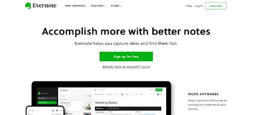
Another button that’s typically in the top right-hand corner of header designs is the login. This button is then replaced with the user’s profile image once they’ve logged in. It also gives clients or members easy access to their profile and settings.
Take this design by Evernote:
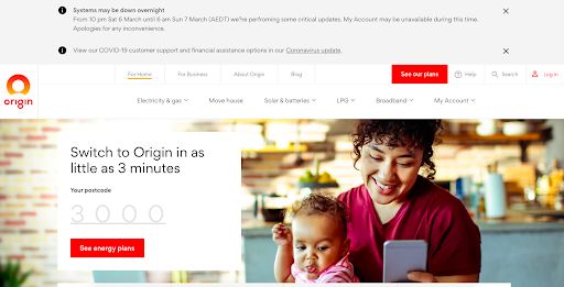
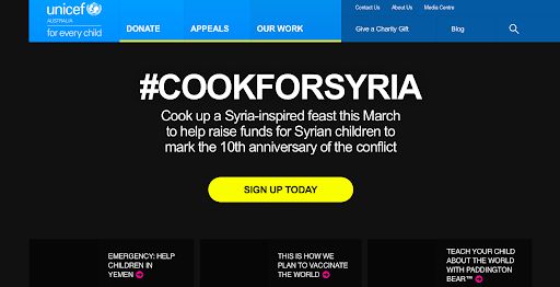
If you want your users to see specific updates or news, the home page header is the best place for it. It’s the first thing they’ll see, after all!
Take the pandemic – websites communicated updates on deliveries or opening hours in the header space.
The goal of your call to action button is to entice visitors to click and take action, like “buy now” or “get your free trial”. So, where is the best position for a call to action in your header? According to the Gutenberg Diagram, Western readers scan pages
in a Z-pattern. That’s how we read – left to right and top to bottom. That means the best position for a CTA is at the end of the Z pattern.
But that’s not a hard and fast rule. It’s better to focus on creating clear and strong CTAs that pop off the page and entice visitors to click.
What size should a website header be? There’s no strict answer to this question. The most important thing is that it works best on the device screen that your users are viewing your website on.
Our tip for header designs is to use common sense. If you have a content rich website, like The Guardian, use a small header.

For an online store, where you want to feature seasonal deals, a larger header works.
It’s also good practice to leave enough space to show what’s below the fold, so people are enticed to keep scrolling.
Fixed headers stay in place at the top of the page. They do not follow you as you scroll down the page.
A floating header, also known as a “sticky” header, follows you as you scroll. It may change to become more compact as you move down the page – a shrinking header. The benefit of this is that the website visitors can easily navigate to another part of the site and see key site information, such as contact information, without having to scroll back up.
The hero image makes up the background of the header on most websites. It is the first thing people will see, so choose your header image carefully. It can tell a story, evoke a particular emotion and inspire visitors to scroll further.
Designers take different approaches to hero images depending on the business. An ecommerce site usually uses a product image, or lifestyle images that show the product being used. Others might use a seasonal offer as the hero image.
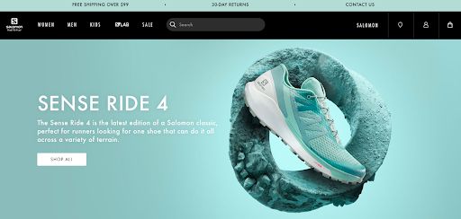
Check out this beautiful hero image by sportswear company Salomon:
Consider these image options:
Video backgrounds are highly popular now too. This header by Allpress Espresso shows a simple video of two guys sitting outside a cafe chatting, as other people walk by. It’s beautifully simple and tells a story that the company then explains below the fold: “It’s about inspiring a journey of human connection that starts with a great coffee.”
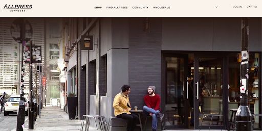
Source: https://row.allpressespresso.com
Whatever you choose for this header section, follow one rule: use high-quality photos or videography.
Always invest in good media for your website header image so you show the company in the best light.
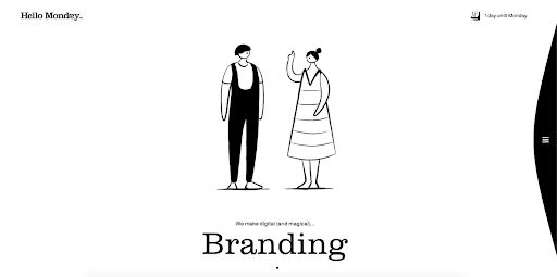
Keeping a header clean and simple can be the best way to get your one key message to stand out. Using white space, or negative space, is a good way to achieve this. Check out this header area by a creative agency, Hello Monday:
Hidden navigation, aka the hamburger menu, is a brilliant way to keep your header clutter-free, while still ensuring it has everything your visitors need.
The hamburger menu is a small icon of three stripes, resembling a hamburger, that displays the full menu when clicked. It started out on mobile design to save space but is now used across desktop sites too.
This web design element also provides additional benefits for responsive and adaptive design by hiding navigation elements and making the interface look consistent on different devices.
It’s great for landing pages but less suitable for ecommerce sites, where people want to browse lots of different product categories.
Consider the colours and effects that will show the brand’s personality from the outset. For example, you can have a floating effect when visitors hover over the navigation, which shows you are light-hearted. But designs like these are less appropriate for professional businesses, such as accountants.
Choose clear, readable fonts that are quick and easy to read. Don’t be tempted to choose fancy fonts that are hard to read – the header is not the place for these! Though, you can play with bold typography and font size to capture attention on larger header.
Also, use words that are short where possible, so they fit on the mobile screen and have maximum impact.
Before designing a header, consider what you want to achieve from the website. What is the overall goal? What’s the feel of the website design? What experience do you want users to have from the outset?
Here are some website header design examples for common site types:
This header is ideal for magazines or content focused sites, or even brands that promote articles and inspirational stories, like Red Bull:
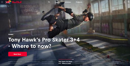
Despite being a product, the brand uses its website to tell inspirational stories about adventure sports – and it all starts in the website header.
If the main focus is to promote the brand, the header should focus on starting to tell your story in a way that grabs attention and builds trust. Consider a strong hero image that portrays the brand, or a visual cue, like this one by IKEA:
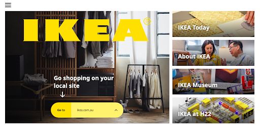
The bold text means there’s no mistaking which website you’ve landed on. As soon as you scroll down away from the header, the IKEA logo appears in the corner.
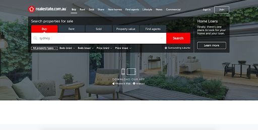
You want to urge a consumer to do something as soon as they land on the site. Put the main call to action in the header, like this header by Domain:
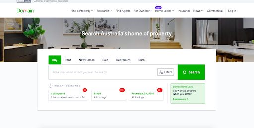
It invites users to search the real estate location they want, right off the bat. You might also include your contact details and email address in the header.
Make sure the header is displayed perfectly on the mobile version of the website as well as the desktop. It must be responsive for any mobile device.
Here are some of our favourite website header designs:
Why we love it: Canva promises you can design anything using their tool. Then it invites you to type in what you would like to design. How can you resist?
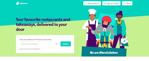
Why we love it: Deliveroo uses illustration in a simple design that gets people searching for their nearest food outlet from the get-go. The hamburger menu keeps things clean and easy to navigate too.
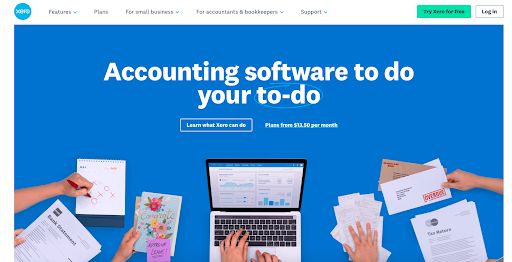
Why we love it: The bookkeeping software sets up the brand story instantly with a no-fuss header that tells the user exactly what they need to know. The calls to action are subtle but enticing, with the green button standing out in the corner.
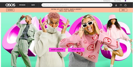
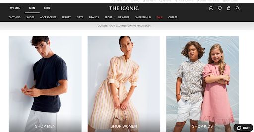
Why we love it: The clothing company gets everything right – from the eye-catching hero image to the simple menu options. Women and Men are split to either side of the header making it easy for shoppers to navigate.
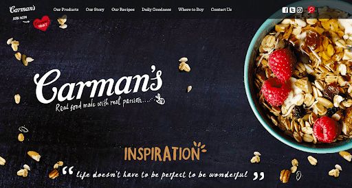
Why we love it: Dark and bold, this header entices you immediately with its stunning hero image and fun design.
First impressions matter, and the website header is how you make your first impression to visitors. Your website header is a vital part of your visitor’s website experience, so dedicate the time to get it right. You can use a lot of creativity to make it stand out and keep it fresh, so long as the core common elements are there to ensure people have a brilliant user experience.

A forward-thinker by nature, Ryuji’s vision is motivated by his experience and ingenuity. Having worked at the forefront of digital design for many years, Ryuji brings with him the determination to generate powerful and innovative solutions.
11 Apr 2024

11 Apr 2024

11 Apr 2024
11 Apr 2024

11 Apr 2024

11 Apr 2024
03 Apr 2024
03 Apr 2024